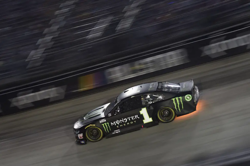
Earlier this year, NASCAR published a survey for its Fan Council to offer feedback directly to the sport. Nothing out of the ordinary, until fans got to an unexpected question.
Fans were asked their thoughts on six different number styles and to rank them accordingly. Immediately, the survey got passed around on social media, and even on the r/NASCAR Reddit page.
When NASCAR shared the details for the 2020 All-Star Race that the numbers would be slid back slightly to accommodate more sponsor space, I stood FIRMLY against the move. Many fans took to social media to express their displeasure with the sudden and seemingly random change to the tradition of the number being right beneath the window net.
However, I am personally an individual who isn’t afraid to take a chance, or to make a change – exactly what NASCAR was trying to do.
So I went into the race with a clear head, not forming a biased opinion of the long-standing tradition of number placement. Having a background in television production, and having colleagues who design cars and focus on the business aspect, I wanted to incorporate the overall idea with their jobs in mind.
When the 2020 All-Star Race was complete, my stance against the number placement changed, and I found myself actually wanting more of this.
And from what I’ve seen, I am not alone on the matter. A report surfaced from SBJ’s Adam Stern, that NASCAR is in continued talks with teams to potentially implement the idea again, on a more permanent basis.
But before you start typing your opinion in response to this, there are two main things that need to be interpreted before shutting down the idea altogether – the concept of a logo, and the exposure a sponsor gets for their dollar.
Logos are a breed of their own
There are logos EVERYWHERE we look. There is likely a logo right in front of you as you read this article. Logos are etched in our brains as, psychologically, one can develop a connection or comfort towards a logo. You had to go past the TobyChristie.com logo to even start to read this article thanks to the featured image.
There are quite a few different kinds of logos in the design world, a few of which I will highlight.
A wordmark is extremely common in NASCAR, with some primary sponsors only utilizing their wordmark most of the races. Look at Smithfield as an example. The same exact logo is used on both the hood and the sides of the car – just adjusted for size. The same can be said for other sponsors such as UniFirst, Ally, and Fastenal.
A pictorial logo is rather self-explanatory. It’s a picture or icon that represents a brand. A few examples of this include the McDonald’s Golden Arches, Shell oil and gas, and the NBC Peacock.
A combination mark is when both a wordmark and a pictorial logo are combined to make a brand new logo. Some of the best examples include Burger King, Starbucks Coffee, and Amazon.
Sponsor space is the key to large exposure
Let’s look at it from a sponsor’s perspective. Their main goal can vary from sponsor to sponsor, whether it be to build brand recognition or to sell a product or service to a race fan.
When you are watching the race on television or even in the grandstands, there are two main places you’re likely going to see for most of the time tuning in – the hood space, and the sides of the car. The hood is the largest space of advertising on the car – it’s typically the largest decal, and it’s what garners a great allotment of attention.
The sides of the car, in my opinion, aren’t usually given the proper amount of respect towards viewing time. When you see a battle going into a turn on the television, you’re likely going to see it from a camera placed at the inside of Turn 3, where the main focal point of the camera is the left side of a race car. The same can be said when battles are taking place on the backstretch itself, where typically the camera placed above the start-finish line is zoomed in to capture the action. When you’re sitting in the grandstands at most tracks (i.e. oval based) the right side of the car will likely capture your attention the most. The same goes for social media posts, especially when photographers are getting shots of the car. You’re likely going to see the sides of the car more often, depending on where the photographer is staged, such as just behind the catch fence high atop a turn.
Moving the number back gives sponsors a bigger space to work with when advertising their brand. This is especially important for new sponsors to the sport or for the new fans entering the sport – to make their presence known.
On the night of the All-Star Race, many sponsors took advantage of that space well. The biggest example I saw a major difference in was with Jimmie Johnson, and his Ally sponsored Camaro.
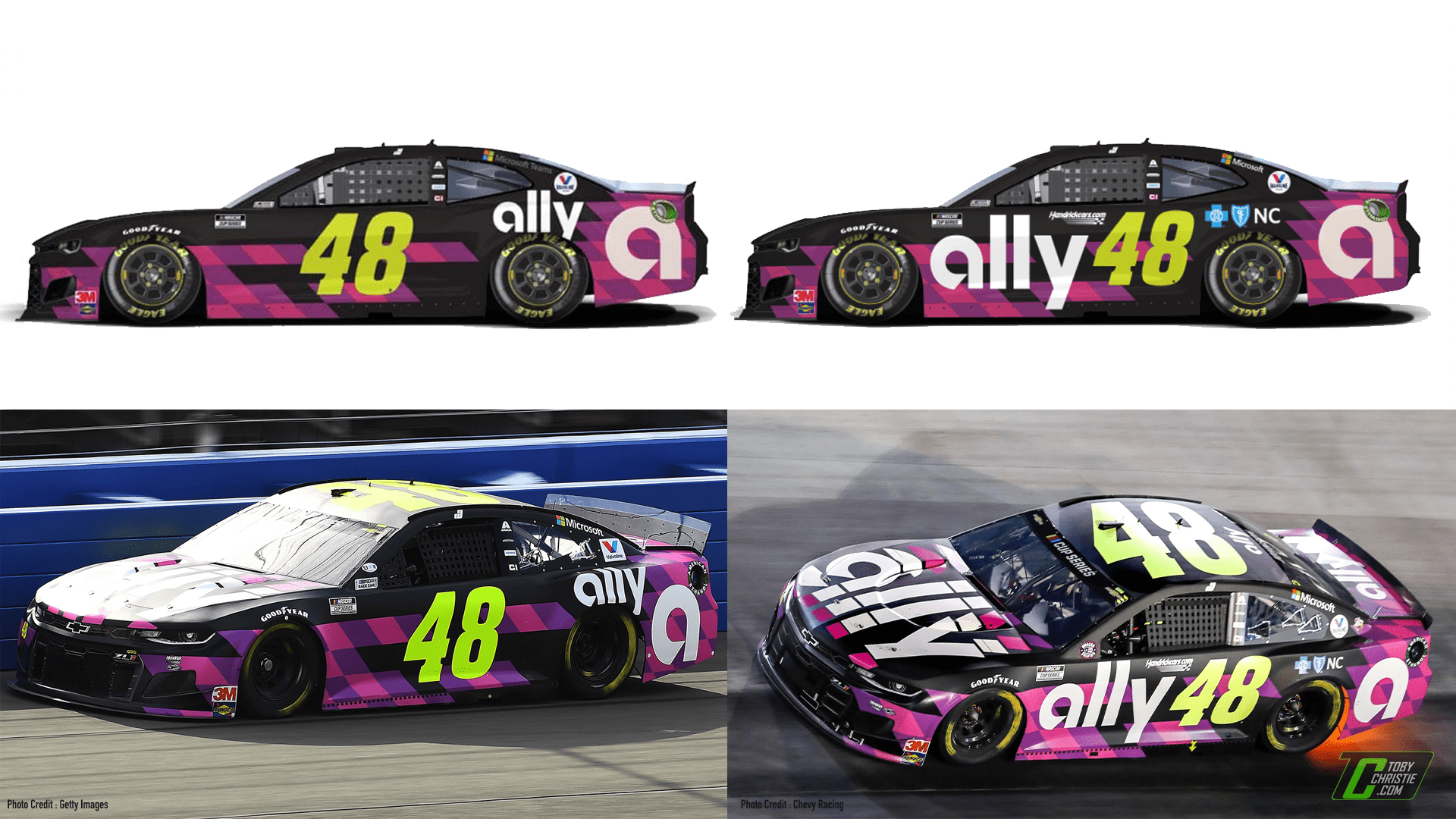
Take a look at the traditional scheme, pictured left. The “ally” logo above the rear wheel is rather small, and that is because Ally doesn’t have a very wide, or long primary logo. Their wordmark is small, so the space above the rear wheel does fit the logo, but it’s barely noticeable. Excluding the number, fans are likely to be drawn to the “a” on the rear quarter panel first. A brand new fan might not necessarily care about who is sponsoring the car, but the sponsor likely wants that fan to remember who the sponsor is, to generate interest in the respective brand. Additionally, Ally did not have to sacrifice the already established “a” icon on the rear quarter panel, or even the base design in the Blue Cross Blue Shield North Carolina area when moving over to the All-Star race format.
When it comes to logo recognition, the additional space also can accommodate pictorial logos much better, compared to the space that is used above, or around the rear wheel.
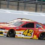
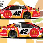
Take look at the sides of Matt Kenseth’s No. 42 McDonald’s / McDelivery Camaro. The first thing you probably noticed besides the number, is the McDonald’s Golden Arches. But compared the sizes of the logo from behind the number, to in front. It’s a rather substantial size difference. This is especially important to brands so well known as McDonald’s, even more so with their iconic logo. Likely when you see the logo, you might start thinking about a product or item from McDonald’s like the fries or the Big Mac. This is the key to the move – maximizing the space for advertising. If the sponsors are happy, they’re likely to extend and throw more money into a race team.
A major gain, when executed correctly
Granted, there were some schemes that just simply did not execute the number design correctly.
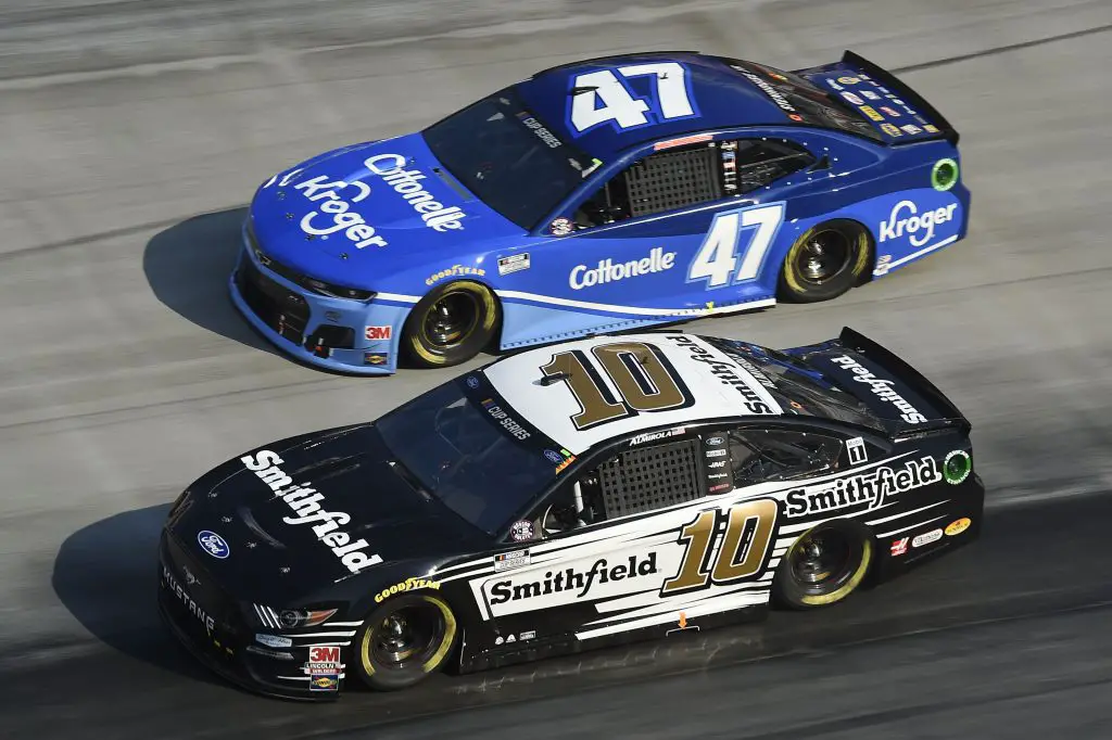
The first one that comes to mind is Ricky Stenhouse Jr.’s scheme design.
When compared to Aric Almirola’s, you can clearly see a missed opportunity to make the Cottonelle logo larger to bring more eyes in. Perhaps there was a reason behind the decision, but imagine if the team had placed the Kroger logo in that space instead. Add in changing the base scheme to accommodate the logo like the No. 10 team did, there was a better opportunity to promote the brand. Moreover, compared to the No. 10 of Almirola’s, there are two Smithfield logos present on the car, with two chances of catching a fan’s attention. The area above the Kroger logo, while it looks clean, failed to deliver on a chance to place another logo in that area, even perhaps Cottonelle.
One of the major selling points of the move would be that sponsors would get a larger area of space to advertise, or in Smithfield’s case, a second opportunity to put another set of large “Smithfield” wordmarks on the car. What sponsor wouldn’t be happier with a whole another area to place their branding? They can be thrilled about the decision, but the sponsor needs to maximize the space to their benefit.
With the larger space to cover, teams and sponsors can change their course a bit and quite literally advertise the product itself in the space.
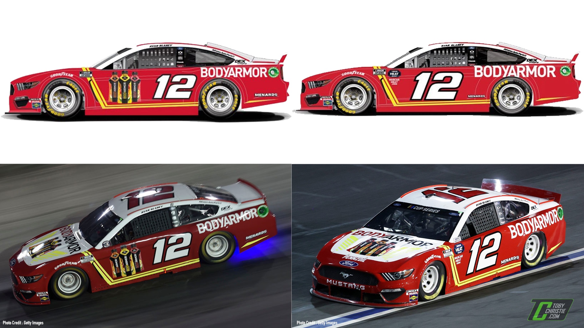
In the example of Ryan Blaney, BodyArmor opted to place their bottled drink in the space. Seeing the product directly on track could potentially add influence to a fan to purchase the product – and that’s one of the main foundations when it comes to the nature of sponsorship. Companies want to build brand awareness and draw in new customers. Additionally, BodyArmor has three different chances for their physical product to be seen by consumers. Fans can see the BodyArmor product on the hood as traditional, but then twice more on either side of the car. This is especially important when it comes to what fans are likely to see the most whether it be at the track or on television – the front of the car, and the sides.
Should this style become the norm, designers and sponsors would really need to work together to maximize the space to draw more fans to the logo or product. I firmly believe that the number placement was not favorited more than expected likely because many teams did not take full advantage of the paint scheme base design. Many sponsors decided to keep the same standard base and just simply slid the number back. Of course, it is going to look strange if fans are so used to seeing one particular design often. If the teams and designers had the opportunity to give ample time to the design change of the number placement, I really think the outlook would become more positive.
But in some cases, a team may not even have to make any major changes to the existing scheme designs should they want to keep the same base design from season to season to build continuity.
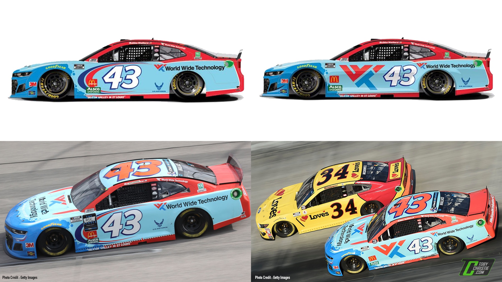
Bubba Wallace’s World Wide Technology design barely changed for the All-Star Race with the new number placement. In fact, it benefitted the sponsor from an exposure standpoint.
Take a look above the rear wheel – you can see that the World Wide Technology logo is present, along with their abstract logo. On the All-Star scheme, the only major design change seen here is that the iconic “Petty Swooshes” that are present in front of the number are removed, in favor of a much larger World Wide technology logo. Furthermore, the logo placed above the rear wheel on the All-Star race scheme shrank ever so slightly, but in return, the unique logo for WWT is now even more visible. If a company wants to build brand awareness (especially as WWT became the namesake of Gateway), this gets the company’s logo out on a larger scale on the car in a prime viewing area.
Not every team will likely see this outstanding result of brand exposure from such a small change, but it can become an attraction for new sponsors looking to see their logo as big as possible on a NASCAR race car.
What about the other series and number styles?
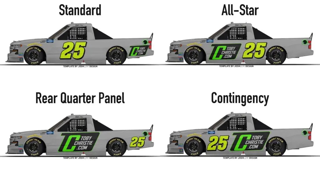
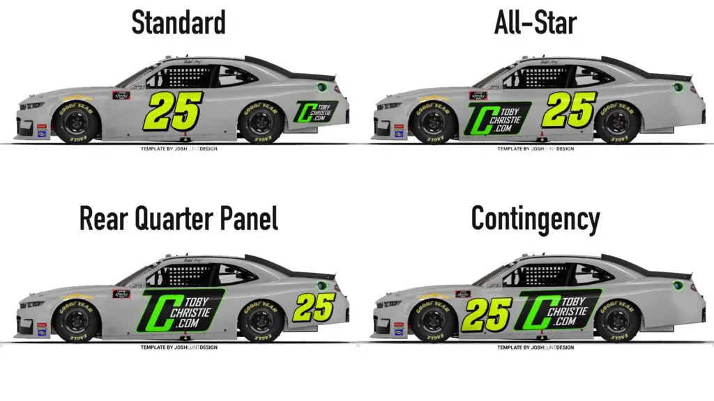
While the Cup Series only ran a different number style once in 2020, the Camping World Truck Series, and Xfinity Series never saw that idea within their series. It began to ruminate in my own mind how these styles would look in other series.
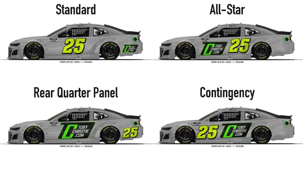
The concepts below were personally created by myself, to try and not only generate more conversation, but to give you an idea of how the number placement could look in the other series.
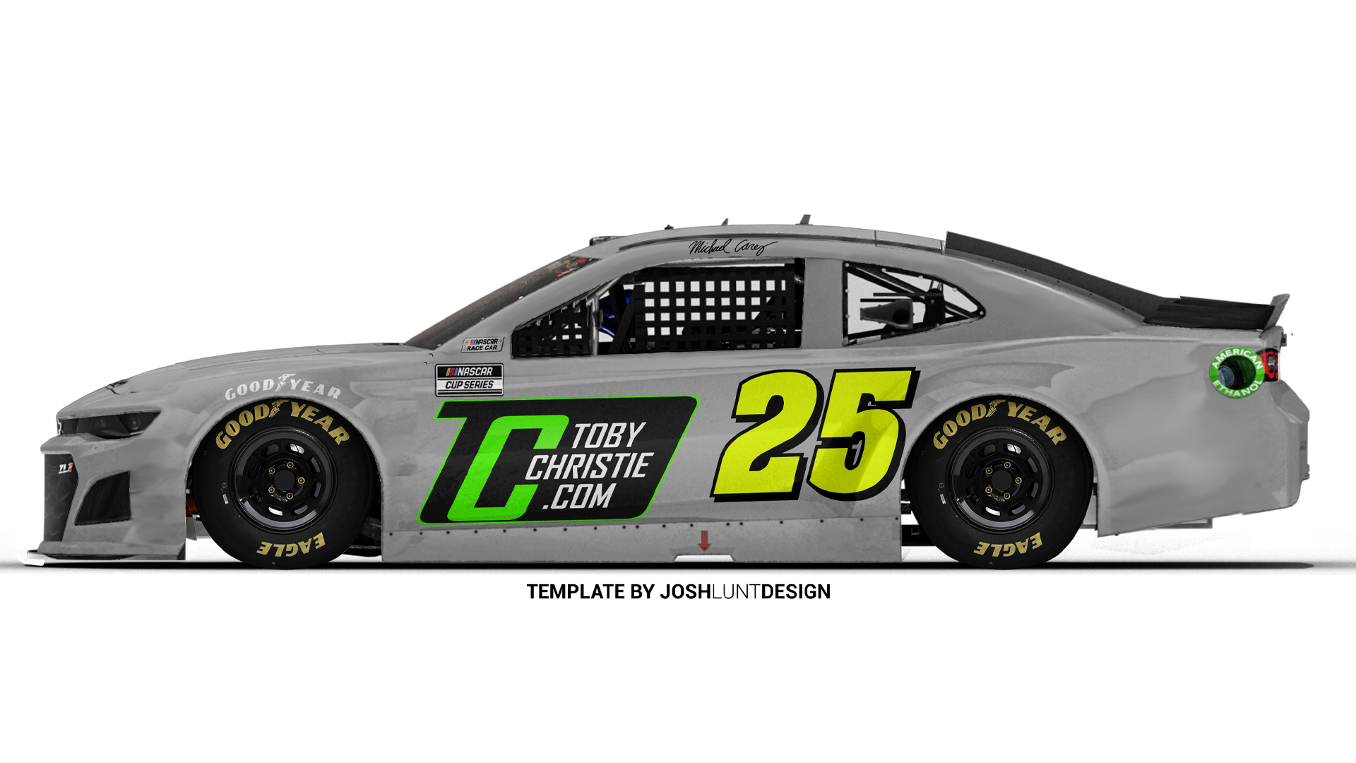
The template for each series was created by Josh Lunt, a young designer who generously made the templates available to members of the NASCAR Design Community Discord Server. The No. 25 was created by the Big Evil Racing design team. The examples below feature the same number, and a logo to help visualize the idea. The four concepts below were inspired by four of the six choices that NASCAR provided in the aforementioned Fan Counil survey.
Personally, I’ve always been a fan of the rear quarter panel number style, which has been used on occasions in the ARCA Menards Series, and some of NASCAR’s international efforts. Also, this wouldn’t even be the first time that NASCAR was flirting with moving the numbers to the rear quarter panel, even in 2020.
One fan I spoke to suggested making the number styles become series exclusives – where each series would run their own number style. I do not oppose the idea, and I think it would be interesting to see that practice executed in a real race scenario.
Interestingly, a select group of fans has already been getting somewhat accustomed to one of these number styles in recent years.
The eNASCAR Heat Pro League Series is a competitive esports league directly associated with the sanctioning body, along with video game developer 704Games. Based in North Carolina, 704Games develops the popular NASCAR Heat Series of games for Xbox, Playstation, and PC.
Since the league’s inception a few years ago, all the cars that the series races with, whether it be in Trucks, Xfinity, or Cup, all come with a rear quarter panel number configuration, giving fans the chance to see what the idea looks like.
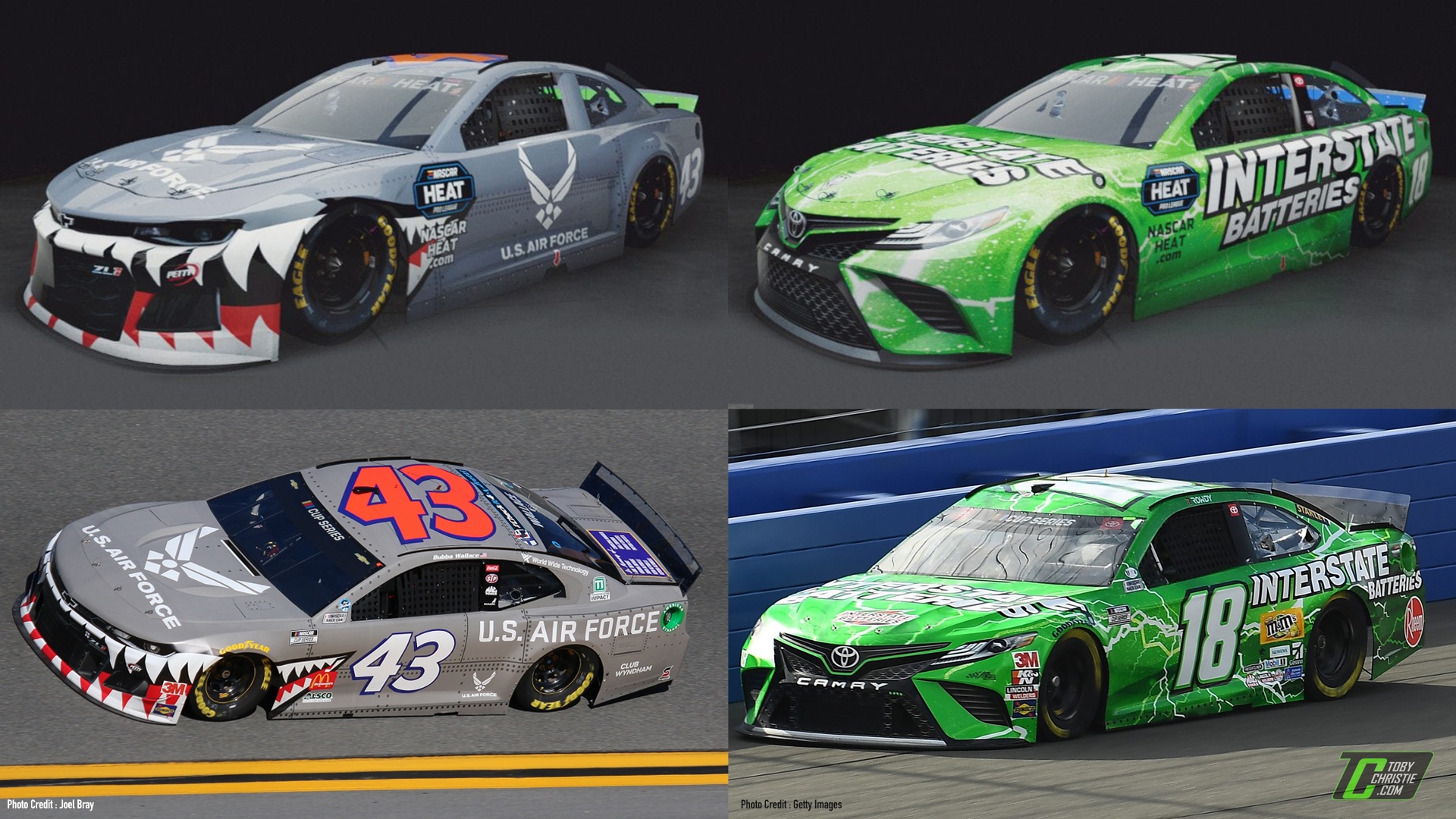
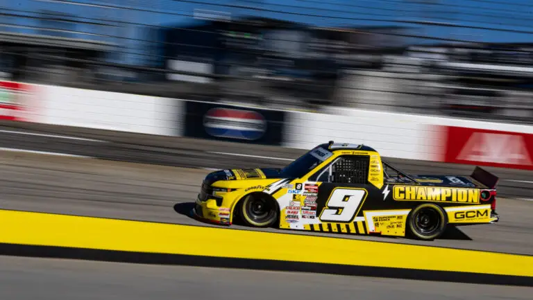
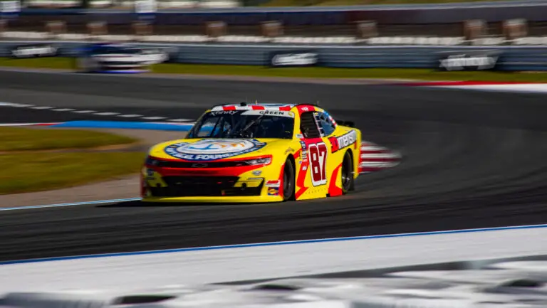
Pictured on the top row are drivers Diego Alvarado and Josh Parker respectively and their Pro League schemes. The bottom row shows the real-life representation on track.
As I mentioned earlier, our minds are more likely to remember pictorial logos rather than words. You can see with the rear quarter panel numbers, the U.S. Air Force can put their logo directly on the door. Compared that to where the logo is found on the on-track version with Wallace – its size is minuscule.
Josh Parker’s No. 18 Interstate Batteries / Gibbs Gaming Camry takes near full advantage of the added space. The wordmark of “Interstate Batteries” is huge, it’s nearly impossible to miss. Now picture this car running at the racetrack from the stands – it will undoubtedly be the first thing you notice on the race car instead of the number, as many fans are used to.
Now there is one major drawback to the idea of a rear quarter panel number placement. Should the rear quarter panel be destroyed from a crash or from a tire failure, the number could either be partially or completely gone from the car. This can be a challenge to the spotters in properly identifying cars on track. While I would fully support rear quarter panel numbers, I do not believe NASCAR would ever seriously implement that change before options such as the All-Star race format.
Wallace’s spotter, Freddie Kraft, chimed in on the topic as well, calling prominent door numbers a “must-have”, likely throwing the idea of the rear quarter panel numbers to the trash.
100% a must have. Back in the 90’s you could easily identify the Goodwrench #3, the Valvoline #6, or the MGD #2 without numbers. But in the current age of different sponsors every week, you need the door numbers to be prominent enough to recognize each driver.
— Freddie Kraft (@FreddieKraft) December 21, 2020
Change is (likely) not imminent
Everyone has their own opinion, and some do not want change and that’s expected. For now, it’s likely that NASCAR will not implement a number change for the 2021 Cup Series season on a more permanent basis.
The Fan Council survey mentioned earlier in this did feature Next Gen models with each number concept, which are expected to arrive at the track full-time in 2022.
The 2020 All-Star Race was a great starting point for the idea and I applaud NASCAR for trying something new, even if members of the executive team were bombarded with tweets in the process.
Here’s the thing – should NASCAR opt to keep the number in its All-Star position, the number is still in the same general area, just slid back slightly. If NASCAR decided to move the number to the rear quarter panel, I could foresee a bigger uproar since the number is moving to a completely different part of the race car.
It’s not confirmed if the idea will return to the track for 2021, or if NASCAR will try a new number format. But with whatever NASCAR decides next, give it a chance.
Change can be a good thing.





2 Responses
My guess is that an expanded side-placement would also cost the sponsor more, which is out of my realm of interest but still noteworthy. BUT, my oldest and still biggest beef is that side view does not show the mfgr; I am a Ford fan, could care less who the sponsor is or who the driver is, side views of a NASCAR car do not show the mfgr. but should. I strain during televised front views of the front views/nuances, which are historically short views, but the side views are most predominant. Show me the blue oval even on the back markers, that is what motivates me.